Ever wonder why you end up with a folder full of logo files once branding is complete? At first glance, it might feel like overkill. But each file serves a purpose. Together, they make sure the brand you build works everywhere, from web to print, without a hitch. Skipping this step can cause more work and headaches down the road, especially if the colors or formats are not handled right.
Colors: Pantone, CMYK, RGB, Hex
When creating a brand identity, it starts with a Pantone (PMS) color. Pantone gives a universal standard, a shared language for color. Once that is picked, it gets translated to:
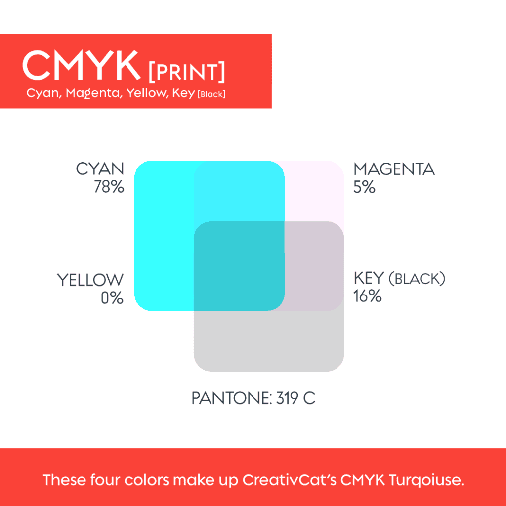
CMYK (Cyan, Magenta, Yellow, Black), the four inks used to produce full-color print jobs. CMYK files are must-haves for printed materials because they let printers closely match your Pantone color. CMYK printing tends to be less expensive than printing with spot Pantone inks. That said, not all printers deliver the same fidelity when converting a Pantone to CMYK. For brand-critical materials, some printers still request or prefer actual Pantone (spot) printing to guarantee color match across materials.
RGB (Red, Green, Blue) + Hex (#), used for anything digital such as websites, social posts, and online ads. On screen, colors are made of pixels, so they often look brighter than print. Hex codes provide the exact RGB color values needed in HTML or CSS.
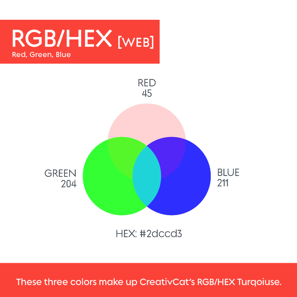
Beginning with Pantone and translating it into CMYK and RGB helps keep colors consistent. Without that, a blue that looks crisp online might print dull or off-tone, which can hurt brand consistency.
File Formats: Vector vs Raster
Once colors are locked, the next thing is formats.

Vector files, built using mathematical points, can scale infinitely with no loss of quality. These are essential when printing large items such as banners, posters, or apparel. Common vector formats include AI (Adobe Illustrator), EPS, PDF, and SVG. EPS generally does not support transparency. PDF files are editable via various programs, and SVG files work well on the web for crisp, scalable graphics.
Raster files, pixel-based formats like JPG and PNG. JPG always comes with a white background included, while PNG supports transparency, which is useful for mockups, web overlays, or placing a logo on colored backgrounds. Raster files are useful for digital uses such as social media or web graphics, but they lose quality if scaled up too much. For print, resolution matters. Typically, 150–300 dpi is ideal.

Having both vector and raster versions ensures the logo works in many contexts, no one-size-fits-all limitations.
Why it Matters, Especially When You’re Buying a Logo
When a brand does not include a full file and color package, it is often because the logo was purchased cheaply via a ready-made or stock logo marketplace such as LogoStack or Fiverr. In these cases, the next designer frequently needs to vectorize the logo and match the colors and formats. That can take significant time depending on the logo’s complexity and may result in additional out-of-pocket costs for your business.
If you go this route, make sure you receive the full package: vector files, raster files, and correct color values (Pantone, CMYK, RGB/Hex). Otherwise you inherit extra work and potentially inconsistent branding.
Also be aware that if a logo is built on Canva, you do not own the stock elements used in the design. That means you may not have exclusive rights to trademark the logo, and you could be limited to raster outputs instead of scalable vectors.
Providing all the right files and color guides ensures a brand is ready for anything, from a website and business cards to apparel, packaging, or large-format print. Everything needed is included in your small digital brand guide, so future designers or printers do not have to guess.